


BLOG
Layout Shift: Why the Page Moves as You Reach for It
4 min read
Cumulative Layout Shift is the Core Web Vital that measures movement nobody asked for. The four usual causes, how to find yours, and how to fix each one.
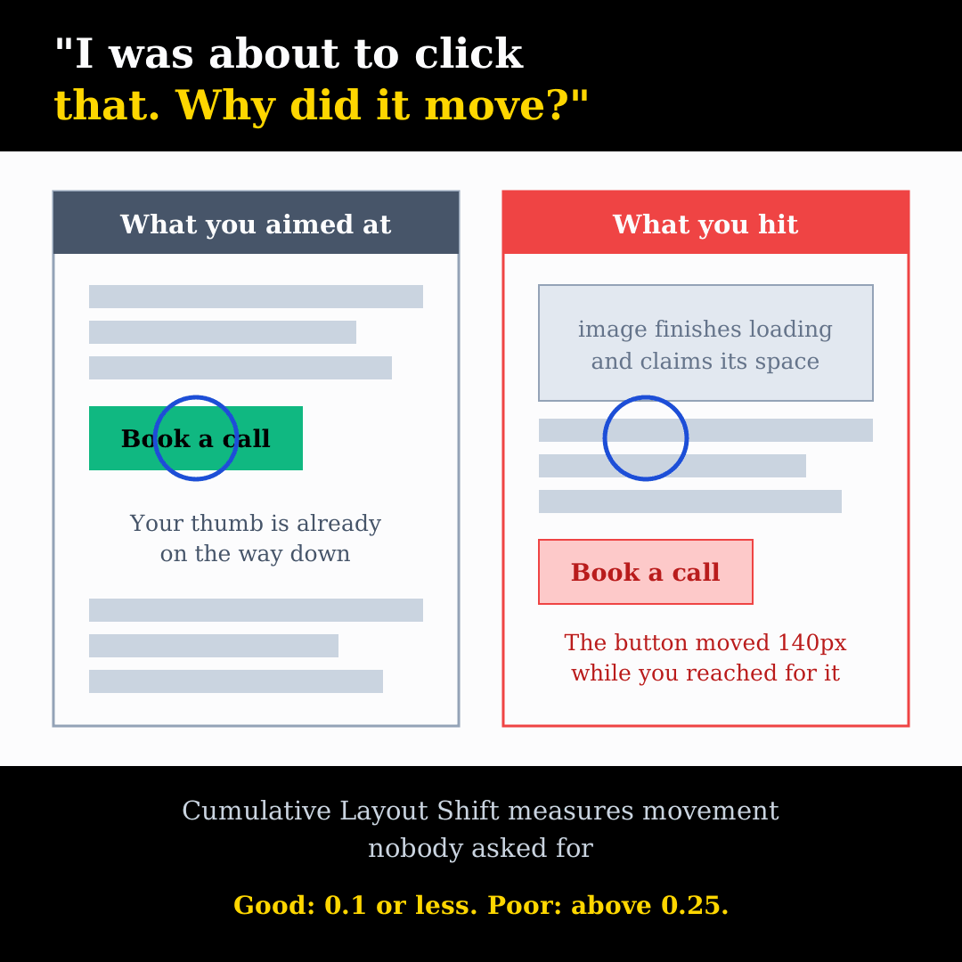
You land on a page, find the link you want, and reach for it. An image finishes loading somewhere above, everything slides down, and your finger lands on an ad instead. Or the cookie banner appears and swallows the button. Or the text reflows mid-sentence and you lose your place.
Everyone has done this, usually while annoyed. It has a name, a score and a place among the three metrics Google uses to judge page experience, and on most sites it is one of the easier things to fix. It is also one of the few problems where the technical measurement and the human complaint match exactly.
What the Score Actually Measures
Cumulative Layout Shift, or CLS, is one of the three Core Web Vitals, alongside LCP for loading and INP for responsiveness. It measures how much visible content moves unexpectedly while someone is using the page.
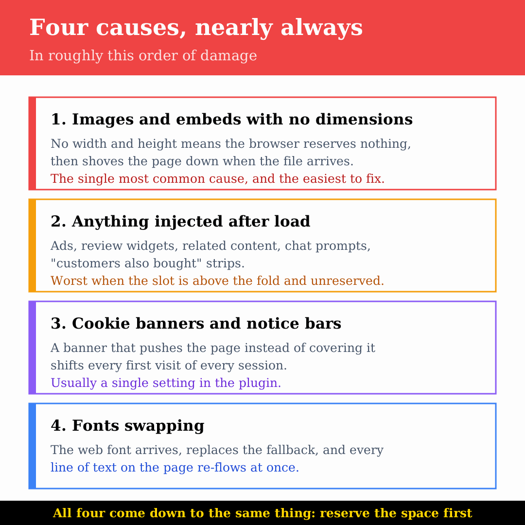
Each shift is scored on two things: how much of the screen moved, and how far it moved. A small icon shifting slightly barely registers. A full-width banner pushing the whole page down is expensive. The scores are grouped into bursts — shifts within a second of each other, capped at five seconds — and your CLS is the worst burst, not the total.
The targets are unchanged: 0.1 or less is good, above 0.25 is poor, measured at the 75th percentile of real visits over a rolling 28-day window, with mobile and desktop counted separately.
One important exception: shifts that happen within 500 milliseconds of someone clicking or tapping do not count. Opening an accordion, expanding a menu, loading more results — those are expected, because the user asked for them. CLS is only about movement nobody requested.
The Four Usual Causes
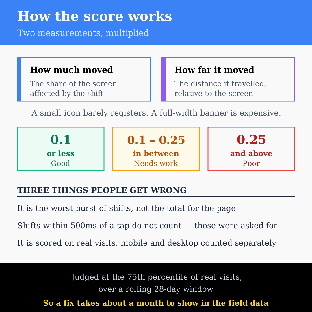
Google’s own guide to optimising CLS names the same four culprits that turn up on nearly every site we look at.
Images and Embeds With No Dimensions
This is the big one. When an <img> has no width and height, the browser has no idea how much room to leave, so it lays the page out with nothing there and then shoves everything down when the image arrives. Same for video, maps, and anything in an iframe.
It became common when responsive design arrived and developers dropped the attributes in favour of sizing images in CSS. Modern browsers use width and height to work out the aspect ratio and reserve the right space, so the attributes are back in fashion for good reason.
Anything Injected After the Page Loads
Ad slots, related-content blocks, review widgets, chat prompts, “customers also bought” strips. If a script adds a block to the page a second after load and nothing was holding space for it, everything below jumps.
Ads are the worst case because the slot size is often unknown until the ad is served. If the block is above the fold and not reserved, every visitor gets a jolt.
Cookie Banners and Notice Bars
Worth separating out, because almost every site has one and most of them are implemented badly. A banner that pushes the page down rather than sitting over it produces a large shift on the first load of every single session. The free-shipping bar at the top of a shop does the same thing.
Fonts Swapping
A web font loads after the page renders, the browser swaps out the fallback, and every line of text re-flows because the two fonts have different letter widths and heights. On a text-heavy page this moves everything at once, which is exactly what the score punishes.
Why It Costs More Than a Score
The ranking signal is real but small. The user experience cost is bigger and easier to measure yourself.
A shifting page produces mis-taps, and a mis-tap on a phone usually means an accidental navigation, a back button, and a visitor who has lost their place. On a checkout or an enquiry form, that is an abandoned session. On a content page, people lose the line they were reading and often give up rather than find it again.
It is worse on mobile, where the viewport is small, the shifts are proportionally larger, and connections vary enough that elements arrive at unpredictable moments. It is also invisible to the people who built the site, because they test on fast connections with everything cached, where most of these shifts never happen.
Finding Your Own Shifts
Three steps, none of which take long.
- Run the page through PageSpeed Insights. The field data at the top is what Google actually uses, and the lab section below lists which elements shifted.
- Reload the page in Chrome with the Performance panel recording. Layout Shift records appear with a score and a rectangle overlay showing what moved. This is the quickest way to see which element is responsible.
- Throttle the connection and watch. Set the network to a slow profile in developer tools and reload with your eyes on the screen. Shifts that are invisible on office broadband are obvious at 3G speeds, which is how a real visitor on a bad signal sees your site.
Test the pages that matter rather than the homepage alone: a product page, a blog post with images, and the contact or checkout page.
Fixing Each Cause
Reserve Space for Images
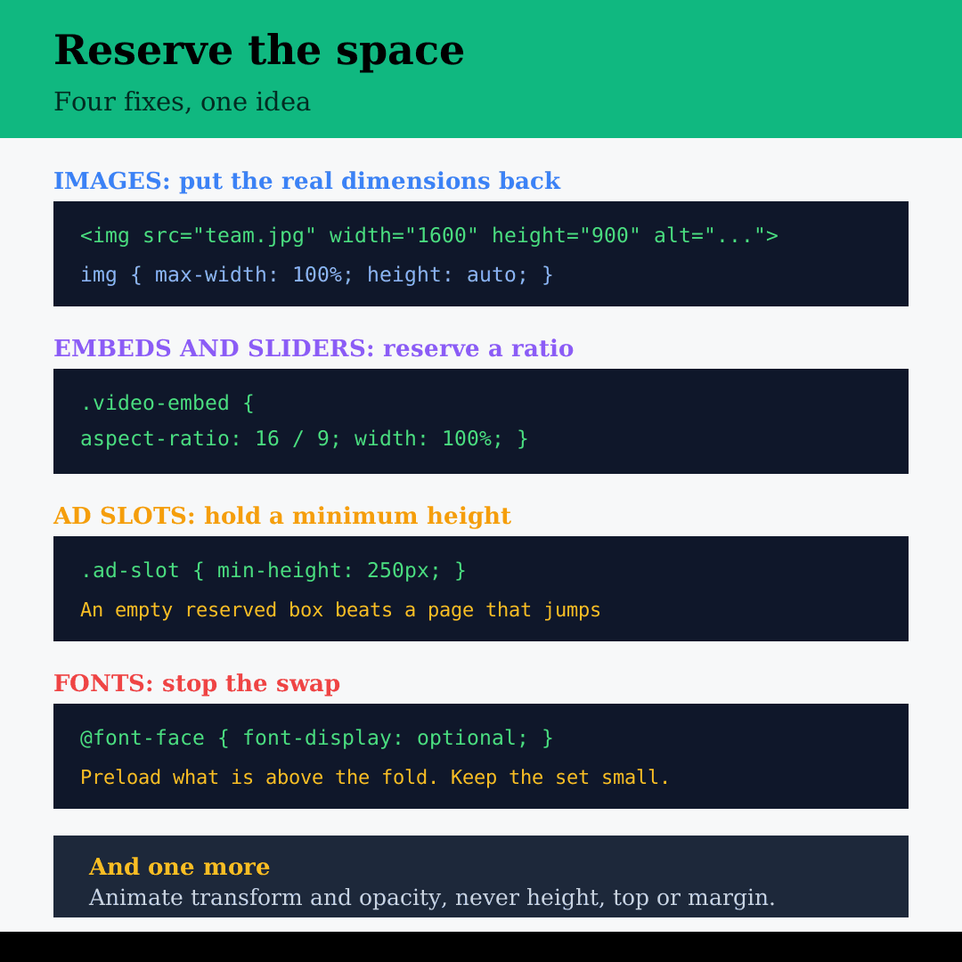
Put the real dimensions back on the image. The browser works out the ratio and holds the space even when CSS resizes it:
<img src="/images/team.jpg" width="1600" height="900"
     alt="Our team at work">
img {
max-width: 100%;
height: auto;
}For anything where you cannot set dimensions directly — an embed, a slider, a container filled by script — reserve the space in CSS instead:
.video-embed {
  aspect-ratio: 16 / 9;
  width: 100%;
}
Hold Space for Injected Blocks
Give ad slots and dynamic blocks a minimum height matching the most common size they will be filled with. An empty reserved area looks slightly odd for a moment; a page that jumps is worse. Where a block might be empty entirely, put it below the fold so nothing above it can move.
Overlay the Banner, Do Not Push the Page
Cookie banners and notice bars should be positioned over the content, not inserted into the flow above it. If the design requires a bar that occupies real space, render it server-side so it is there in the first paint rather than injected afterwards.
Stop Fonts Reflowing
Preload the fonts you actually use above the fold, keep the set small, and pick a fallback with similar metrics. font-display: optional eliminates the swap entirely at the cost of some visitors seeing the fallback for that visit, which on many sites is the right trade. Self-hosting rather than calling a third-party font service also removes a connection from the critical path.
Animate the Right Properties
Animations that change height, top or margin trigger layout and count as shifts. The same effect built with transform and opacity does not. This catches a lot of page-builder entrance animations.
On WordPress
Most of the damage comes from four places, and all four are fixable without touching a theme file:
- The cookie plugin. Check whether the banner overlays the page or pushes it. Most have the setting; many default to the wrong one.
- Sliders and hero sections. A slider that builds itself in JavaScript starts at zero height. Give the container a fixed height or aspect ratio in the page builder’s settings.
- Images added outside the media library. WordPress adds dimensions to images inserted normally. Images placed by a page builder widget, a theme option or pasted HTML often have none.
- Lazy loading without reserved space. Lazy loading and missing dimensions together are the most reliable way to produce a jumping page, because every image arrives late and unannounced.
If the site also feels slow, the two problems usually share a cause. Our guide to speeding up a WordPress website covers the server and caching side.
Before You Ship
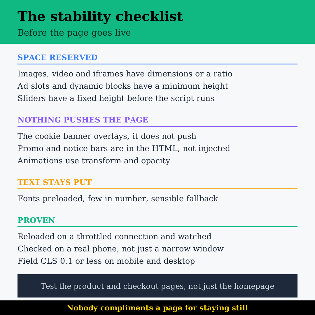
- Every image, video and iframe has width and height, or a CSS aspect ratio.
- Ad slots and dynamic blocks have a reserved minimum height.
- The cookie banner overlays the page instead of pushing it down.
- Notice bars and promo strips are in the HTML, not injected later.
- Fonts are preloaded, limited in number, and matched to a sensible fallback.
- Entrance animations use transform and opacity.
- The page has been reloaded on a throttled connection and watched.
- Field CLS is 0.1 or less on mobile as well as desktop.
Visual stability is one of the least glamorous parts of web design and one of the most noticeable when it is missing. Nobody compliments a page for staying still. They just manage to click the thing they were aiming at, which is the entire point of a website build that works.
If your pages jump around on a phone and you’re not sure which element is to blame, we can find it and fix it. Get in touch.
FAQs
0.1 or less. Between 0.1 and 0.25 needs work, and anything above 0.25 counts as poor. The number is judged at the 75th percentile of real visits, which means roughly three quarters of your visitors need to see a stable page, not just the average one. Mobile and desktop are scored separately, and mobile is usually the weaker of the two because the screen is smaller, so each shift covers proportionally more of it. If you only check one, check mobile.
Because the lab test is a single load on a fast connection in ideal conditions, and your visitors are not. Lab tools also stop measuring at the end of page load, so shifts that happen when someone scrolls, when an ad refreshes, or when a widget finally appears never register. The field data at the top of the PageSpeed report comes from real visits and is what Google actually uses. If the lab says good and the field says poor, trust the field and go looking for shifts that happen after load.
If it pushes the page down rather than sitting over it, yes. It appears on the first load of every session, it is usually full width, and it usually arrives after the first paint, which is the worst combination the score can measure. It is also one of the cheapest fixes on the list, because most consent plugins have a setting for exactly this and simply ship with the wrong default. Change it to overlay and re-test.
No, and this trips people up. Any shift within 500 milliseconds of a click or tap is excluded, because the movement was requested. Opening an accordion, expanding a menu, loading more results, submitting a form — all fine, as long as the response comes quickly. The metric is only concerned with movement nobody asked for. This also means you do not need to design away every moving element, just the ones that move on their own.
The lab score changes the moment you re-run the test, so you will know immediately whether the fix worked technically. The field data is a rolling 28-day window of real visits, so Search Console and the field section of PageSpeed will keep showing the old figures while new data accumulates. Expect roughly a month before the score reflects the change. Fix it, confirm it in the lab, and check back in four weeks rather than four days.
By Matrix Internet


