BLOG
5 Tips For Creating High Converting Landing Pages
How to Design Landing Pages That Drive Conversions Landing pages are a crucial part of your marketing strategy, serving as the first touchpoint for visitors who click on your banner ads, PPC ads, or promotional emails. Their primary goal is to encourage a specific action—whether it’s making a purchase, signing up for a newsletter, or […]
How to Design Landing Pages That Drive Conversions
Landing pages are a crucial part of your marketing strategy, serving as the first touchpoint for visitors who click on your banner ads, PPC ads, or promotional emails. Their primary goal is to encourage a specific action—whether it’s making a purchase, signing up for a newsletter, or downloading an eBook. A well-optimised landing page can make all the difference in the success of your ad campaigns.

To ensure your landing page achieves its purpose, you need to focus on design elements that encourage conversions. Let’s explore the essential components that will help you create high-performing landing pages.
1. Ensure Clarity and Relevance
Visitors make snap decisions about whether your landing page is relevant to their needs. If they can’t quickly find what they’re looking for, or if the page has usability issues, they’ll leave, increasing your bounce rate. To avoid this, capture attention immediately with clear messaging that entices visitors to stay and take action.
The relevance of your landing page also affects your bounce rate. Google tracks how many users return to search engine results (SERP) after visiting your page, so it’s essential to provide engaging, focused content. Limit distractions by eliminating unnecessary links, menus, or buttons that could lead visitors away from the intended action.
Make sure your landing page focuses on one specific campaign and goal. Clarity is key—too many choices can overwhelm visitors, making them less likely to convert.
2. Craft a Benefit-Driven Headline
Your headline is the first thing visitors will see, so it needs to be compelling. A bold, benefit-oriented headline grabs attention and tells visitors exactly what value you offer. It should align with the messaging from the ad or email that brought them to the page.
To strengthen your headline, add a concise subheadline that expands on the main message. Together, they should clearly communicate why the visitor should stay on the page and take action. Support your headline with relevant imagery that reinforces your message, but avoid heavy visuals that could slow down page load times.
3. Create a Strong, Clear Call to Action (CTA)
The CTA is the heart of your landing page—it directs visitors to take the desired action. To maximise conversions, limit the actions users can take to just one, whether it’s signing up for a service or making a purchase.
Your CTA should be clear and action-oriented, using strong, persuasive verbs that motivate users. Make it stand out by designing it as a button rather than a text link, and choose a contrasting colour that draws attention. The placement of the CTA is also critical—ensure it fits logically with the flow of the page and is easy for visitors to find.
Remember, a clear and compelling CTA can make the difference between a bounce and a conversion.
4. Optimise for Mobile Users
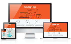
With mobile browsing on the rise, it’s essential to ensure your landing page is mobile-friendly. A responsive design adapts your page to fit any device, providing a seamless experience for both desktop and mobile users.
Mobile users can be frustrated by pages that require pinching or zooming, or where buttons overlap with important information. By testing your landing page on various mobile devices, you can ensure it functions correctly and looks great, improving the user experience and reducing the bounce rate.
5. Maintain Brand Consistency
Your landing page should align with your overall brand identity. Use the same fonts, colours, and design elements as your main website to create a cohesive look and feel. Consistency helps reinforce your brand in the minds of visitors, building trust and familiarity.
This consistency across your marketing materials and landing page also signals professionalism, which is key to building credibility and encouraging conversions.
Final Thoughts
A successful landing page is one that quickly captures attention, maintains clarity, and directs visitors toward a single, clear call to action. By focusing on relevance, strong headlines, clear CTAs, and mobile optimisation, you can create landing pages that convert and boost the ROI of your ad campaigns.
If you need expert help designing landing pages that drive results, get in touch with Matrix. Our team specialises in creating landing pages that not only look great but also deliver powerful results.


