BLOG
The eCommerce Retailer’s Guide to Using Color
Things you can do to increase conversions eCommerce is a big business. In the U.S., eCommerce sales are expected to reach $500 billion by the end of 2017; European sales are expected to hit $250 billion by the end of this year, too, which means there’s a lot of online competition. In the past, eCommerce […]
Things you can do to increase conversions
eCommerce is a big business. In the U.S., eCommerce sales are expected to reach $500 billion by the end of 2017; European sales are expected to hit $250 billion by the end of this year, too, which means there’s a lot of online competition. In the past, eCommerce sites were treated with suspicion, but innovations in technology and security, as well as convenience, have made online shopping simple and popular.
When it comes to staying ahead of your competition, in terms of your website’s design and performance, there are numerous things you can do to increase conversions. One of the most important things is the colour scheme.
What Is Your Favorite Colour?
There is a very good reason why choosing the right colour scheme is imperative when it comes to eCommerce conversions. As you probably know, colours have a big impact on our attitudes and emotions.
When we see a certain colour, that colour will trigger a response in a region of the brain known as the hypothalamus. This will, in turn, send a signal to the pituitary gland, while another signal will go to the thyroid glands. The thyroid glands signal the release of hormones, which directly impact mood, emotion, and certain behaviours. This is why most of us have a favourite colour.
Now that we know how colours affect our emotions, let’s talk about how we can take advantage of this to improve your eCommerce website’s conversions.
Where Should You Use Colour?
Since colour is ubiquitous, it’s important to understand where you should use the following tips. We will discuss the colour scheme of an eCommerce website design. By choosing the right colour scheme, you are making sure that different design elements work together. These can be hero graphics, headline types, borders, backgrounds, buttons, and even popups.
Aside from choosing the most suitable colour scheme, you shouldn’t forget about typography and graphics, which are all equally important.
Let’s go over the most important steps and concepts when choosing or changing the colour scheme of your eStore.
Colour Psychology
Colour psychology is a part of the much broader field of behavioural psychology that tries to explain how different colours affect human behaviour. To simplify this guide, here are some common interpretations of the basic colours. Note, this also depends on different cultures and contexts, as well:
- Red: attention, excitement, anger, stop
- Yellow: enthusiasm, wealth, happiness, competence
- Green: health, money, harmony, balance
- Blue: honesty, corporate, loyalty, trust, reliability
- Pink: compassion, romance, gentleness
- Violet: creativity, royalty, respect
- Brown: sadness, organic, ruggedness, friendliness
- Black: grief, sophistication, expensive
- White: simplicity, order, cleanliness, neutrality
- Grey: timelessness, neutrality, contemporary
What are some of the basic principles of web design in terms of using colours while designing your eCommerce store?
Understanding Your Brand and Vision
Before determining the right colour scheme, it is important to have a clear vision of your brand. In addition, you should be aware of where your products fit in the market, as well as who your target audience is. Once you have an answer to these questions, you and your eCommerce website designer can focus on different colours and their associated emotions to produce a certain kind of effect. Let’s go over a few examples to see how this works.
Luxury products are usually associated with blacks, deep reds, or deep violets. If you look at several famous brands that sell luxury products, you will notice those three colours are usually dominant.
To give you an example, look at jeweller David Yurman’s website or Mercedes-Benz’s website. Both websites offer expensive and quality-made products aimed at a high-end clientele. In terms of website design, both websites offer similar colour schemes of deep blacks with hints of grey.
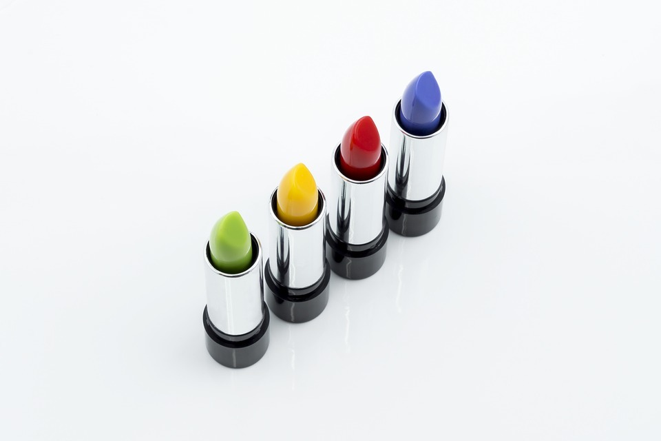
If your eCommerce website sells cosmetics, you should pick red, blue, purple, or green. In a survey on colour and gender, 35% of women said blue was their favourite colour, followed by purple (23%) and green (14%). As you can see, pink is not on the list, which might be surprising for some of you.
However, this might be a stereotype, since only a small percentage of women would choose pink as their colour of choice. Therefore, you should select colours other than pink to improve the appeal of your eCommerce website to female visitors.
It is also important to highlight there are some colours that appeal to both men and women. Blue is one of the top gender-neutral choices and is usually associated with trust, peace, and order. Blue is the colour of corporate America, with a subtle message of trustworthiness.
There are numerous examples that can prove this statement. The world’s biggest social network, Facebook, is blue. This company is attempting to promote transparency and trust, which means selecting blue as the company’s primary colour is not an accident. PayPal combines blue with grey, as do numerous national banks.
There is only one industry where blue isn’t beneficial, and that is the food industry. Dieters use blue plates to successfully prevent them from eating more. Evolutionary theory suggests that blue is a colour associated with poison, and there aren’t many blue foods.
Conclusion
There is a lot that can be accomplished by using colour in the right way, selected with the website’s audience and the function in mind.
Remember that focusing on colour and design is a practical marketing strategy in today’s crowded market. The right colour scheme can enhance your brand positioning and increase your conversion rate.


