


BLOG
Accessible Mobile Menus and Popups: What Breaks and How to Fix It
4 min read
Matrix is proud to join PACE, now launched in Moldova. The Erasmus+ project strengthens youth organisations across the region with training, digital resources and collaboration to support displaced Ukrainian young people.
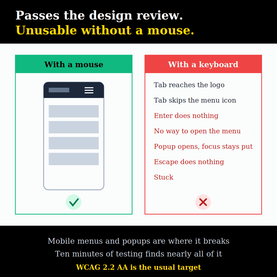
A website can look perfect, pass a design review and still be unusable for part of its audience. The most common place this happens is in two small pieces of every modern site: the mobile menu and the popup.
Tap the hamburger icon on a phone and the menu slides in. Fine. But try it with only a keyboard, or with a screen reader, and many menus do not open, cannot be reached, or trap you somewhere you cannot escape. Popups are often worse.
This guide explains what goes wrong, how to test it in ten minutes, and how to fix it. It is written for site owners and for any web design team that would rather catch these problems before launch than after a complaint.
Why This Matters Now
People rely on it. Keyboard users include people with motor impairments, people with tremors, and power users. Screen reader users include blind and low-vision visitors. Many people use zoom, voice control or switch devices, which all depend on the same underlying code.
The law has caught up. The European Accessibility Act became law in Ireland on 28 June 2025, with the Competition and Consumer Protection Commission acting as the compliance authority for e-commerce and e-books. Equivalent rules apply across the EU, and public sector sites were already covered by the Web Accessibility Directive. Both point to WCAG, the international accessibility standard.
It overlaps with SEO and usability. Proper buttons, links and labels help search engines and every visitor, not just those using assistive technology.
Why Menus and Popups Are the Usual Weak Spot
Most of a website is plain content: headings, text, images, links. Browsers handle that well by default.
Menus and popups are different. They are built with JavaScript, they appear and disappear, and they are usually designed visually first. A designer draws three lines in the corner, a developer makes it respond to a tap, and nobody checks what happens without a mouse or a finger.
Think of it like a building with a beautiful revolving door, but no handle on the side door for people who cannot use the revolving one. From the street, it looks great. For some visitors, there is no way in.
The Most Common Failures
Mobile Menus
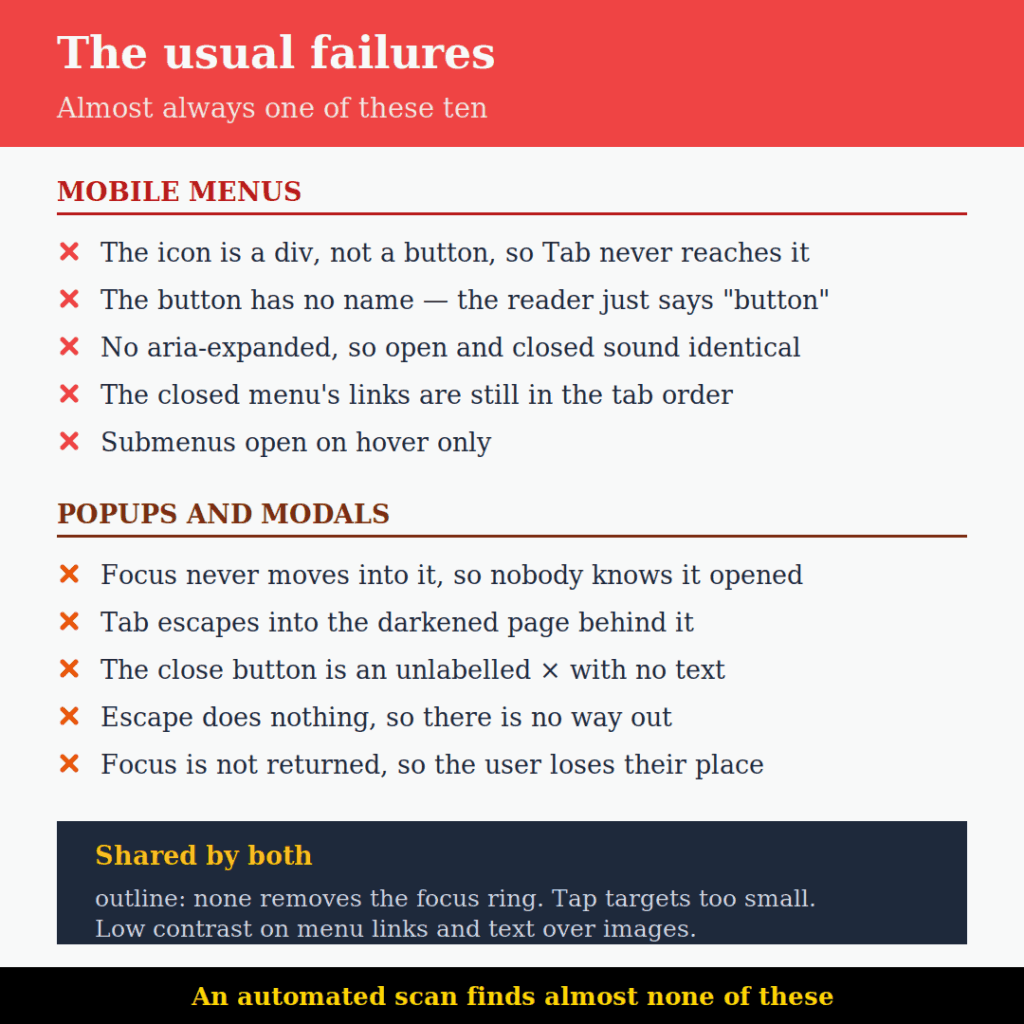
- The menu button is not a button. It is a
<div>or<span>with a click handler. You cannot reach it with Tab, and Enter does nothing. - The button has no name. It is just an icon, so a screen reader announces “button” and nothing else, or reads out the icon font as a strange character.
- No open or closed state. The screen reader cannot tell whether the menu is expanded.
- The hidden menu is still in the tab order. Keyboard users tab through twenty invisible links before reaching the page content, and the focus disappears off screen.
- Or the opposite: the menu opens, but focus stays behind it on the page, so the visible menu cannot be reached.
- Escape does not close it, and the close button cannot be reached.
- Submenus only open on hover. No hover on a keyboard or a touchscreen means no way to reach the second level.
Popups and Modals
- Focus does not move into the popup. It opens visually, but keyboard and screen reader users are still on the page behind it, often without knowing it appeared.
- Focus is not kept inside. Tabbing escapes into the darkened page behind it.
- The close button is an unlabelled “×”. A screen reader reads “times” or “multiplication sign”, or nothing at all.
- No way out with the keyboard. Escape does not work and the close button is not focusable. The user is stuck.
- Focus is not returned afterwards. After closing, focus jumps to the top of the page and the user loses their place.
- The background is still live. Screen readers keep reading the page behind the popup.
- It appears on load or on a timer and interrupts whatever the user was doing or listening to.
Problems Both Share
- The focus outline has been removed with
outline: nonebecause it “looked ugly”. Keyboard users can no longer see where they are. - Tap targets are too small. A tiny close “×” is hard to hit for anyone, and especially for people with limited dexterity.
- Low contrast on menu links, or popup text sitting over an image.
Step 1: Test With a Keyboard (5 Minutes)
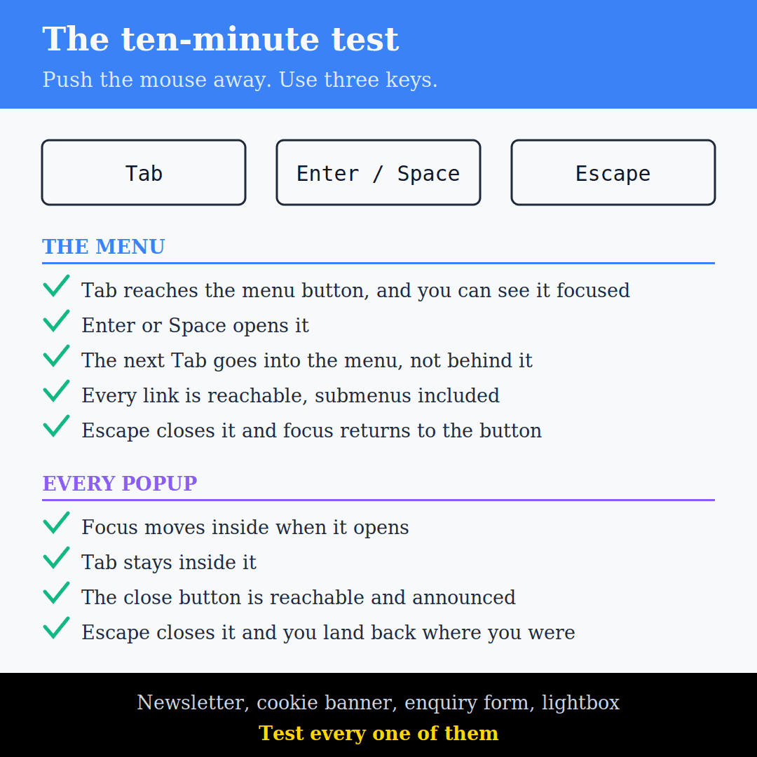
This catches most of the problems above. On a laptop, narrow the browser window until the mobile menu appears, or use Chrome’s device toolbar (Cmd + Shift + M on Mac, Ctrl + Shift + M on Windows, with developer tools open).
Put the mouse aside and use only:
- Tab and Shift + Tab to move forward and back
- Enter or Space to press buttons
- Escape to close things
Check the menu:
- Can you reach the menu button, and can you see that it is focused?
- Does Enter or Space open the menu?
- Does the next Tab go into the menu, not somewhere behind it?
- Can you reach every link, including submenus?
- Does Escape close the menu, and does focus go back to the menu button?
- When the menu is closed, does Tab skip its links?
Then trigger each popup — newsletter, cookie banner, enquiry form, image lightbox — and check:
- Does focus move into the popup when it opens?
- Does Tab stay inside the popup?
- Can you reach and use the close button?
- Does Escape close it?
- After closing, are you back where you were?
Step 2: Test With a Screen Reader (5 Minutes)
Screen readers are built into most devices and free to use:
- Mac and iPhone: VoiceOver. On a Mac, press Cmd + F5 to turn it on or off. On an iPhone, go to Settings → Accessibility → VoiceOver.
- Windows: NVDA, a free download.
- Android: TalkBack, in Settings → Accessibility.
You do not need to master it. Move to the menu button and listen:
- Does it say something like “Menu, button, collapsed”? Good.
- Does it just say “button”, “link”, or read out a file name? It has no proper label.
- After opening, does it say “expanded”?
For popups, listen for the popup’s title when it opens. If the screen reader keeps reading the page behind it, either the popup is not marked as a dialog or focus did not move.
Step 3: Use Automated Tools, but Do Not Rely on Them
Run the Accessibility audit in Lighthouse (in Chrome developer tools) or PageSpeed Insights, or install the free axe DevTools browser extension. They will flag missing button names, low contrast and missing labels.
But automated tools only catch part of the problem. They usually test the page as it first loads, with the menu closed and popups hidden, so they cannot tell whether focus moves correctly or whether Escape works. The manual tests above are the ones that matter. This is also why an audit that consists only of a scan report is worth less than it looks.
Step 4: Fix the Mobile Menu
An accessible menu toggle is a real <button>, with a name and a state:
<button class="menu-toggle" aria-expanded="false" aria-controls="mobile-menu">
  <span class="screen-reader-text">Menu</span>
  <svg aria-hidden="true" focusable="false">...</svg>
</button>

<nav id="mobile-menu" aria-label="Main" hidden>
  ...menu links...
</nav><button>: reachable with Tab, and works with Enter and Space automatically.- Hidden text “Menu”, or
aria-label="Menu": gives the icon a name. aria-expanded: tells screen readers whether the menu is open.hiddenon the closed menu: removes its links from the tab order and from screen readers. Hiding it only by moving it off screen or making it transparent is not enough.
The script then does four things:
const button = document.querySelector('.menu-toggle');
const menu = document.getElementById('mobile-menu');

function setMenu(open) {
  button.setAttribute('aria-expanded', open);
  menu.hidden = !open;
  if (open) menu.querySelector('a').focus();
}

button.addEventListener('click', () => {
  setMenu(button.getAttribute('aria-expanded') !== 'true');
});

document.addEventListener('keydown', (e) => {
  if (e.key === 'Escape' && !menu.hidden) {
    setMenu(false);
    button.focus();
  }
});- Updates
aria-expanded. - Shows or hides the menu with
hidden. - Moves focus to the first link when it opens.
- Closes on Escape and returns focus to the button.
For submenus, add a separate toggle <button> next to each parent item, with its own aria-expanded. Do not rely on hover.
Step 5: Fix Popups
The simplest reliable fix is the browser’s built-in <dialog> element. Opened with showModal(), it handles most of the hard parts for you: it moves focus inside, makes the rest of the page unreachable, closes on Escape, and returns focus when it closes.
<dialog id="newsletter" aria-labelledby="newsletter-title">
  <h2 id="newsletter-title">Join our newsletter</h2>
  ...form...
  <button type="button" class="close" aria-label="Close">×</button>
</dialog>

<script>
  const dialog = document.getElementById('newsletter');
  dialog.querySelector('.close').addEventListener('click', () => dialog.close());
  // open with: dialog.showModal();
</script>
Whatever you build the popup with, check that it:
- has a clear title, linked with
aria-labelledby - has a close button that is a real
<button>with a text label, not just “×” - moves focus inside when it opens, and keeps it there
- closes with Escape
- returns focus to where the user was
- does not open on page load or on a timer unless it really must, and a cookie banner is one of the few cases
Step 6: Fix the Shared Basics
Bring back the focus outline. If your theme removes it, add a clear one back:
:focus-visible {
  outline: 3px solid #1a5fb4;
  outline-offset: 2px;
}
:focus-visible shows the outline for keyboard users but usually not for mouse clicks, which tends to keep designers happy too.
Make tap targets big enough. WCAG 2.2 asks for at least 24 × 24 pixels. 44 × 44 is a comfortable target for menu buttons and close buttons.
Check contrast. Menu text needs a contrast ratio of at least 4.5:1 against its background. Chrome’s developer tools show the ratio when you inspect a colour.
On WordPress
Most WordPress sites get their menu and popups from a theme, a page builder or a plugin, so you often cannot edit the code directly. In practice:
- Test what you have first. Many well-known themes have accessible mobile menus out of the box. The problems usually come from custom headers built in a page builder, or from popup plugins.
- Check the widget settings. Menu and popup widgets often have an option for an accessible label on the toggle or close button, or for closing on Escape. Make sure they are filled in and switched on.
- Prefer fewer popups. Each popup plugin is another thing to test. One well-built popup is better than three that each fail differently.
- Check after updates. Theme and plugin updates can change menu code, so repeat the keyboard test after major updates, or build it into your ongoing support routine.
What to Ask Your Web Design Agency
If you are commissioning a new site, accessibility is far cheaper to build in than to fix later. Ask your web design agency:
- Which WCAG level will the site meet? WCAG 2.2 AA is the usual target.
- Will you test the mobile menu and popups with a keyboard and a screen reader before launch?
- How do you handle focus in menus, popups and lightboxes?
- Will the design keep a visible focus outline?
- Can you provide an accessibility statement for the site?
- Who checks accessibility when plugins or the theme are updated after launch?
A good agency will have clear answers. If the answer is “the theme handles it” or “we run an automated scan”, it is worth pushing further. The same questions are worth asking about an existing site before you commission a rebuild, because they usually reveal whether the problem is the design, the build or the plugins.
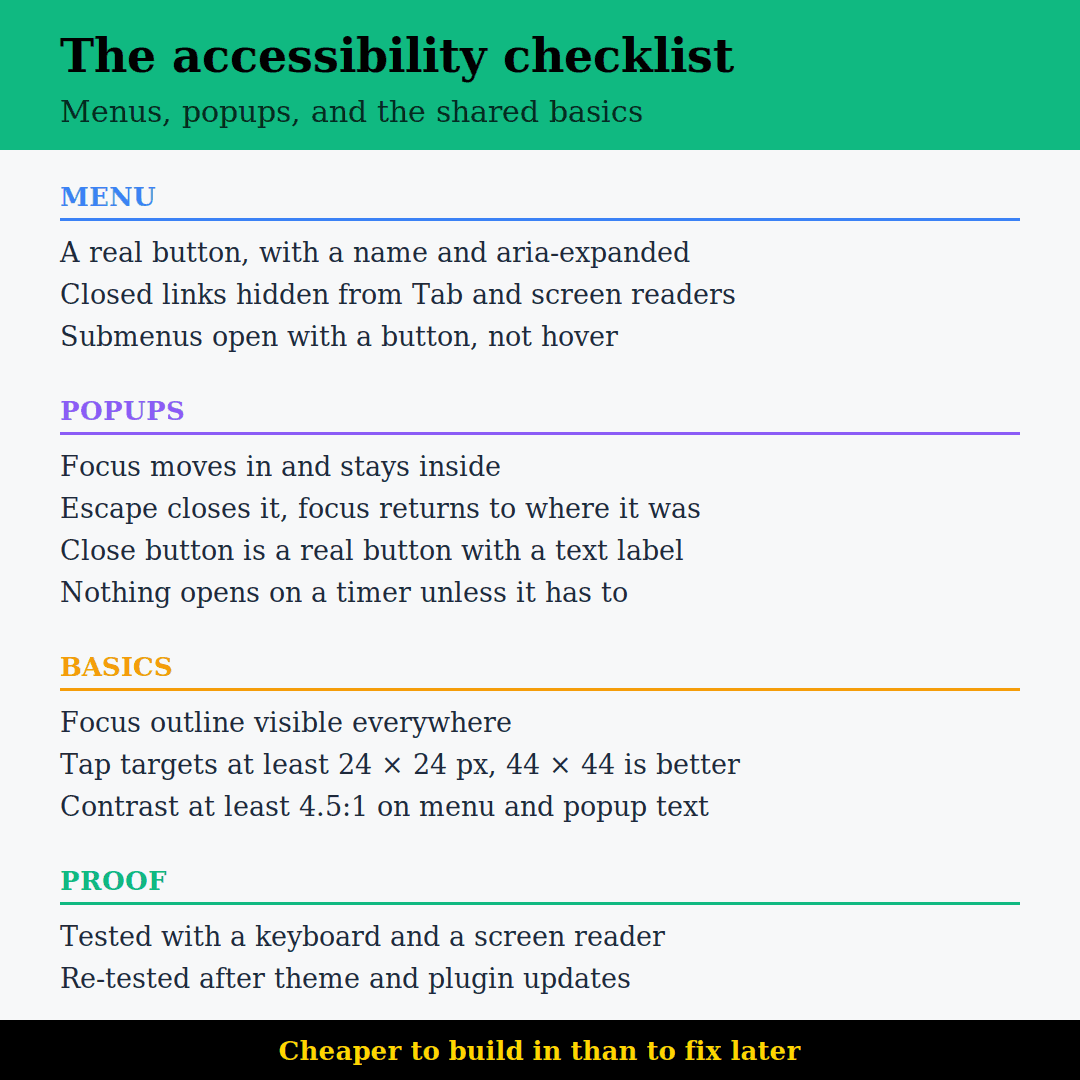
Quick Checklist
- Menu button is a real
<button>with a name. - It has
aria-expandedthat changes when opened. - Closed menu links are hidden from Tab and from screen readers.
- Opening moves focus into the menu, and Escape closes it and returns focus.
- Submenus open with a button, not just hover.
- Popups move focus in, keep it inside, close with Escape and return focus.
- Close buttons are real buttons with text labels.
- Focus outline is visible everywhere.
- Tap targets are at least 24 × 24 px, and contrast is at least 4.5:1.
- Tested with a keyboard and a screen reader, not just an automated tool.
Ten minutes with the mouse pushed aside will tell you more about your site than any scan report. If the menu and the popups pass, most of the rest of the site usually will too.
Not sure whether your menu and popups would pass? We build and test accessible websites for Irish and international clients, and we’ll tell you where yours stands — get in touch.
FAQs
It depends on what you sell and to whom. The Act became law in Ireland on 28 June 2025 and covers consumer-facing services including e-commerce, e-books, banking, transport and telecoms, along with products like ATMs and ticketing machines. If you sell to consumers online, you are very likely in scope, and the Competition and Consumer Protection Commission is the compliance authority for e-commerce here. Public sector websites were already covered separately by the Web Accessibility Directive. If you are a small business and unsure, the CCPC has been publishing guidance aimed specifically at microenterprises.
WCAG 2.2 level AA is the usual target, and it is what most procurement documents, accessibility statements and legal frameworks point to. Level A on its own is too low a bar for a public website, and level AAA includes requirements that are impractical for most commercial sites. AA is achievable on an ordinary WordPress build without unusual effort, provided the menu, popups, forms and colour palette are considered during design rather than patched afterwards. Ask whoever builds your site to commit to AA in writing and to say how they will test it.
A scan is a useful first pass, but it will miss most of what this article covers. Automated tools test the page as it loads, with the menu closed and popups hidden, so they cannot tell whether focus moves into a popup, whether Escape closes it, or whether a keyboard user can reach the second level of a menu. They are good at finding missing labels, missing alt text and low contrast. They are blind to anything that depends on interaction. Ten minutes of manual keyboard testing finds more real problems than any scan.
It is a good starting point and usually means the default header and menu were built properly. The problems tend to appear afterwards. Custom headers built in a page builder replace the theme's menu entirely, popup plugins bring their own markup, and theme updates can change menu code without warning. The accessible-ready label describes the theme as shipped, not the site you ended up with. Test your actual live site, and repeat the test after any major theme or plugin update rather than assuming the label still holds.
No, but fewer is better. Each popup plugin is another component that has to move focus correctly, trap it, close on Escape and hand focus back, and every one of them fails differently. One well-built popup is easier to test and maintain than three that each half work. The bigger issue is timing. A popup that appears on page load or after a few seconds interrupts a screen reader mid-sentence and moves a keyboard user without warning. Trigger them from a click where you can, and keep the timed ones for cases like a cookie banner where there is no alternative.
By Srdjan


