

BLOG
6 web design tips for a killer homepage
In a world of instant gratification online, people won’t wait around if your homepage is below par. You have 50 milliseconds to make a good impression, so if you don’t click with the user right away, you’re ancient browser history — they won’t buy stuff, sign up or read that blog post you spent hours writing. (PS, users spend an average of 5.59 seconds looking at a website’s written content, but hopefully you’re still with us!)
Every page on your site needs to create a good first impression and get a unified message across to your target audience. But your homepage has some extra heavy lifting as a gateway page to the rest of the site, and it usually has the highest exit rate. It’s also essential for SEO, so search engines know exactly what your site is about, for that all-important page 1 or Position Zero ranking.
Ask any group of UX/UI experts for some advice on homepage design and you might get a load of different answers — but you can’t really go wrong with these 6 tips…
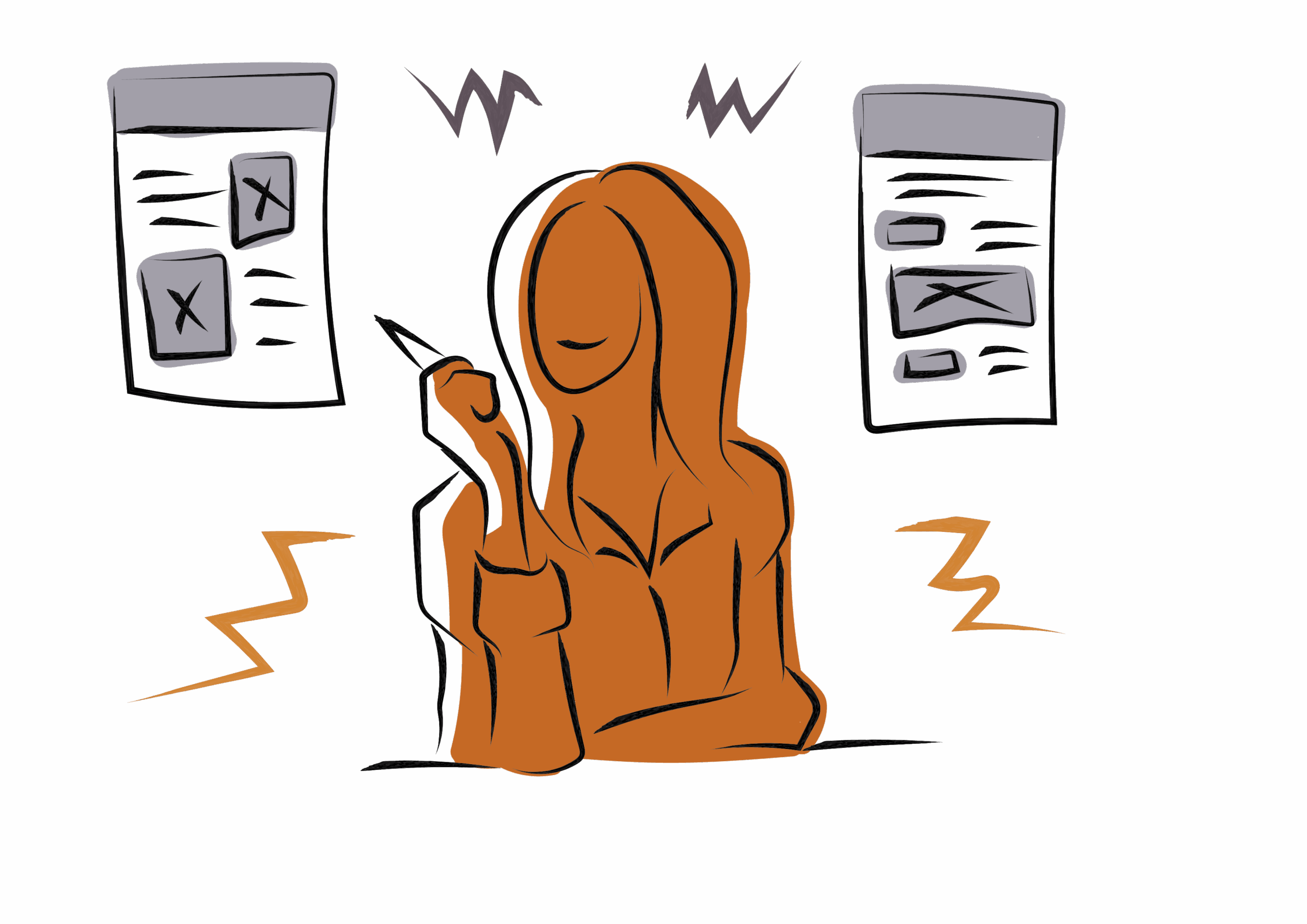
1. Pass the five-second test

We’ve already learned that you have 50 milliseconds to make a good first impression, but you can learn a lot from a website in just five seconds. The five-second test is a research technique used by designers to see if web pages get their message across effectively, and whether users grasp the information.
Participants are shown the web design for five seconds, and after the countdown timer stops they’re asked a series of questions, such as:
- What products/services does the site offer?
- Who do you think the intended audience is?
- Do you trust the site?
- What did you think of the design?
- What are the main elements you can recall?
One way to pass the five-second test is to optimise your content ‘above the fold’ — the header, text or visual content that the user sees before having to scroll. If they find the answers they need quickly, they won’t eject.
Five seconds should be enough time to get your message across with good design. If the user knows what’s going on, they’ll be more likely to trust your brand. Create your own five-second test at fivesecondtest.com.
2. Nail your message with content-first design

Never forget the rule that your website isn’t the product — your content is the product, and you need to design your homepage and website around carefully chosen words, images and graphics. Don’t find a cool visual design and fill it with placeholder text for the time being. Your website is a dialogue with users, and you can’t start a dialogue if you don’t know what you’re going to say.
Using placeholder text like lorem ipsum will keep your whole team in the dark throughout the design and prototype testing phase. If you’re lost at the start of the design phase, you’re already on your way to alienating your target audience.
3. Be consistent

It’s crucial to update your homepage regularly so it never feels dated, but don’t alienate your users by going off script. Make sure your homepage design is consistent with the rest of your site.
Website design consistency is the art of keeping the same look and feel throughout your whole site — from buttons and icons to colours and fonts. Create and maintain a UI toolkit — a company set of standards for colours, typefaces, spacing, iconography and components.
There’s nothing worse than confusing UI elements that confuse the user. If your homepage keeps the same functions, symbols, animations and colour palette as the rest of the site, the user always feels in control. They’ll thank you for being a guide — to where you want them to go!
4. Embrace minimalism

Minimalism values clear content and simple navigation above everything else. The minimalist designer starts with the content, then incrementally adds enough interface elements for users to identify their goal and intuitively know how to navigate to it. A minimalist homepage will be a strong foundation as the user starts their journey.
Use a lot of white or uniform space, and use your restricted palette as a strength — it’s all about clarity through contrast, and saying a lot with little effort.
As an added bonus, a minimalist, non-cluttered homepage will have a quicker loading time, so you won’t frustrate visitors.
5. Avoid cheesy stock photos

The smiling boss in a bad suit pointing at a whiteboard; the glamorous sales rep in a headset looking at the camera; the overly sincere handshake; eye-blitzing word flocks of related terms… these are all stock photo red flags.
Cheesy, cheap stock images are this generation’s ClipArt — they make your brand look cheap and inauthentic, and ruin the user’s first impression. Cheap stock images scream, “That’ll do” — a disaster when you’re trying to entice customers.
Use only professional commissioned photography or images — well shot, well-lit, high-res and on-brand. Or if you must use stock imagery, find rare examples. Tineye is a reverse image search tool that helps you find out how many times a stock image has been used before.
6. Give users an easy path to follow

What’s the biggest turn off for a user? Anything they don’t need. Most people’s ideal web experience is finding what they want quickly, so clear navigation is essential. Your homepage is just a step in the user journey, not a final destination. However, it’s an essential gateway to all the information you want to get across, without clutter getting in the way.
By creating personas for your target audience and mapping out user journeys, you’ll have a good idea of your users’ ideal navigation pathways. Make sure they find the essential information and links they need to move around your site. You can do this through strategic internal links and a central navigation menu. And optimise your buttons — make your calls to action short, clear and tempting, so users can’t resist clicking.
One last home truth — there’s no formula

Rules are made to be broken — or at least changed over time. At Matrix Internet, we’ve broken a few rules as digital innovators for 20+ years. Luckily, we’re always looking forward — Chat to us today about future-facing web design.
By Matrix Internet


