


BLOG
Placeholders Are Not Labels: Fixing the Most Common Form Mistake
4 min read
Matrix is proud to join PACE, now launched in Moldova. The Erasmus+ project strengthens youth organisations across the region with training, digital resources and collaboration to support displaced Ukrainian young people.
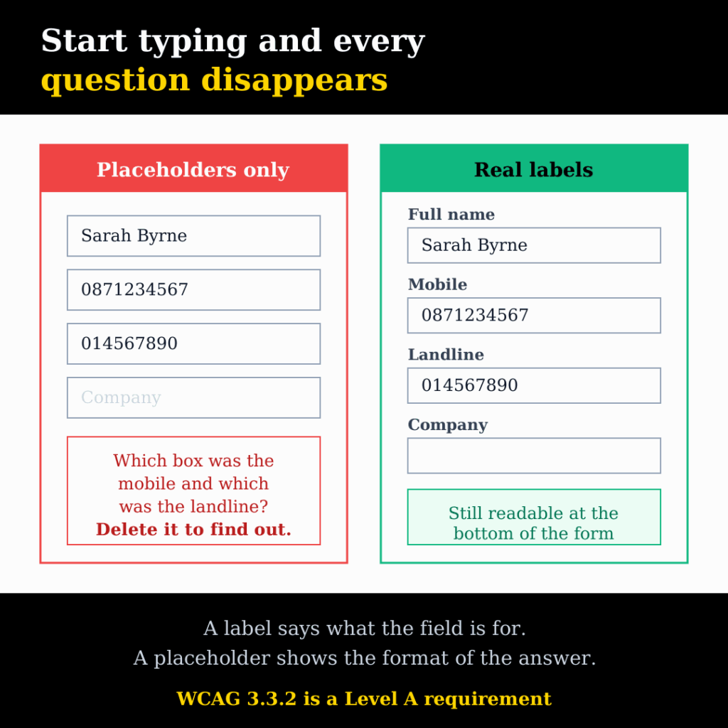
It is one of the most common patterns on modern websites, and one of the easiest to get wrong. The form has no labels. Instead, each field has faint grey text inside it — Name, Email, Phone, Message — and it looks clean, tidy and modern.
Then somebody starts typing, and every question on the form disappears.
This is not a small detail. Forms are where a website finally asks for something, and the placeholder-as-label pattern makes them slower to complete, harder to correct, worse for people using assistive technology, and in most cases non-compliant with the lowest level of the accessibility standard. It is worth fixing on any site, and worth catching during web design rather than after launch.
Placeholders and Labels Are Different Things
A label says what the field is for. It is permanent, it is linked to the field in code, and it stays visible no matter what the user does.
A placeholder is a hint about the format of the answer, shown inside an empty field. “+353 1 234 5678” is a placeholder. “Phone” is a label pretending to be one.
Think of a paper form where the questions are printed in disappearing ink. Fine while the page is blank. Useless the moment you start writing, and worse than useless when you reach the bottom and want to check what you put where.
What Actually Goes Wrong
Nielsen Norman Group’s research on this is direct about it: placeholders in form fields are harmful. The failures stack up.
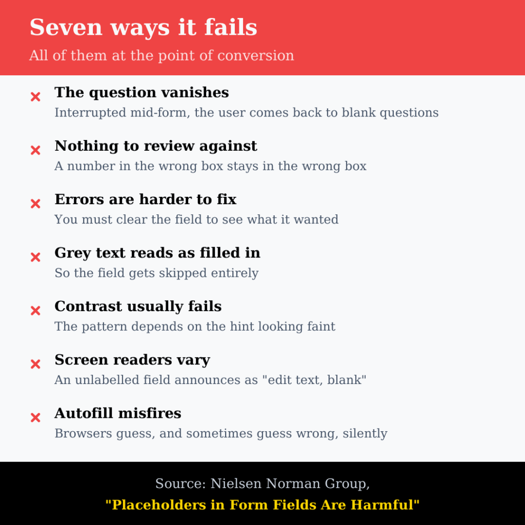
The question vanishes exactly when it is needed. Anyone who gets interrupted mid-form — a phone call, a notification, a child — comes back to a set of filled boxes with no questions attached. The user has to delete their answer to see the hint again.
Reviewing before submitting becomes guesswork. Users scan a completed form before pressing send. Without labels there is nothing to scan against, so a phone number typed into the mobile field instead of the landline field stays there.
Fixing errors is worse. An error message says a field is wrong, but the field no longer says what it wanted. On a long form, people clear several fields just to find out which was which.
Filled fields look skipped, and placeholders look filled. Empty fields draw the eye, so users jump to them and miss ones they half-completed. The opposite also happens: grey placeholder text gets read as a value already entered, and the field gets skipped entirely.
Contrast usually fails. The pattern depends on the hint looking faint, and faint grey on white rarely reaches the 4.5:1 contrast ratio the standard asks for. Make it dark enough to pass and it looks like real content, which brings back the problem above.
Screen readers are inconsistent. Some announce placeholder text, some do not, and some read it and then stop announcing it once there is a value. A field with no programmatic label is announced as “edit text, blank” — which tells the user nothing at all.
Autofill gets confused. Browsers and password managers rely on labels, field names and autocomplete attributes to work out what a field wants. Strip those out and autofill either does nothing or puts the right data in the wrong box, silently.
Where It Costs You
The accessibility argument tends to get the attention, but the commercial one is usually what moves a project.
Forms are the point of conversion. Every second of hesitation, every re-read, every deleted answer is friction at the exact moment the visitor was ready to act. If you are buying traffic through paid campaigns, this is the step you paid to reach, and it is the cheapest one to improve.
It also damages the data you collect. Mismatched fields produce enquiries with a phone number in the company field, an email address in the name field, and a sales team working from records that need cleaning before anyone can act on them.
And it generates support calls. Every “I filled in your form but I’m not sure it went through” is a person who could not review what they entered.
The Standard Is Clear
WCAG Success Criterion 3.3.2, Labels or Instructions, is a Level A requirement — the lowest rung of the standard, not an advanced one. Fields that need user input must have labels or instructions. A hint that disappears on first keystroke does not reliably meet it.
The W3C’s own guidance on labelling controls is equally plain: a label can be visually hidden where context makes it obvious, but it must exist in the code, and most users prefer or need a visible one.
There is a second criterion that catches the same pattern. SC 1.3.5, Identify Input Purpose (Level AA) requires that fields collecting information about the user are marked with the right autocomplete value, so browsers and assistive tools can fill them. Forms built around placeholders usually skip this too.
Since the European Accessibility Act took effect in Ireland in June 2025, consumer-facing services including e-commerce are expected to meet these requirements rather than treat them as best practice. A contact or checkout form failing a Level A criterion is not a subtle finding in an audit.
How to Fix It
The Plain Version
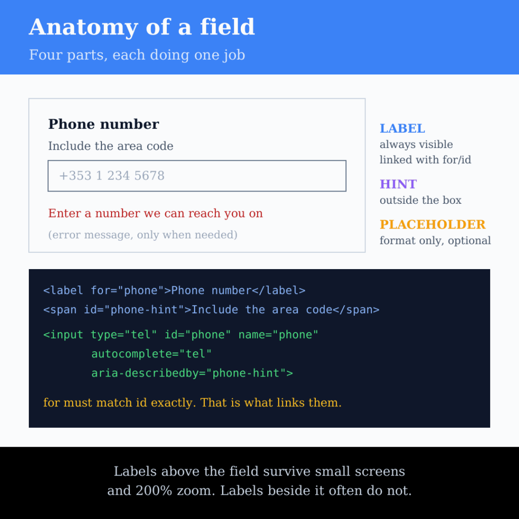
A visible label above the field, explicitly linked to it:
<label for="phone">Phone number</label>
<span id="phone-hint">Include the area code</span>
<input type="tel" id="phone" name="phone"
       autocomplete="tel" aria-describedby="phone-hint">
Three things make this work. The for attribute matches the field’s id exactly, which is what links them. The hint sits outside the field, so it stays visible while the user types. And autocomplete tells the browser what the field is for.
Labels above fields rather than beside them also survive small screens and zoom, which is where right-aligned labels tend to collapse.
If the Design Really Wants the Clean Look
Floating labels are the usual compromise: the label starts inside the field and moves above it when the user types. Done properly it is a real <label> element that moves, not placeholder text, so nothing is lost. Two things to check: the label must still be readable at its smaller size and pass contrast, and it must not collide with the field border at 200% zoom. Many implementations fail one or both, so test rather than assume.
If a designer’s objection is purely visual, that is a conversation worth having during UX and UI design, not after the form is live. A form is not decoration, and a slightly busier form that people complete is better than a beautiful one they abandon.
Use Placeholders for What They Are For
Placeholders earn their place as format examples where the expected answer is not obvious: a date format, an Eircode, a VAT number, a reference code. Even then, a hint underneath the label is more reliable, because it does not disappear. Never use a placeholder to carry the only copy of required information.
On WordPress
Most WordPress forms come from a plugin, and most of these plugins have the setting you need:
- Check the label visibility setting per field. Form builders commonly offer “hidden” labels. Confirm whether that means visually hidden but present in the code, or removed entirely. Only the first is acceptable, and even then a visible label is better.
- Look for a placeholder field separate from the label field. If your builder has both, the label should carry the question and the placeholder should carry a format example or nothing at all.
- Check the autocomplete setting. Several builders expose this per field; many themes override it.
- Re-test after updates. Form plugin and theme updates change markup more often than people expect.
Testing It in Two Minutes
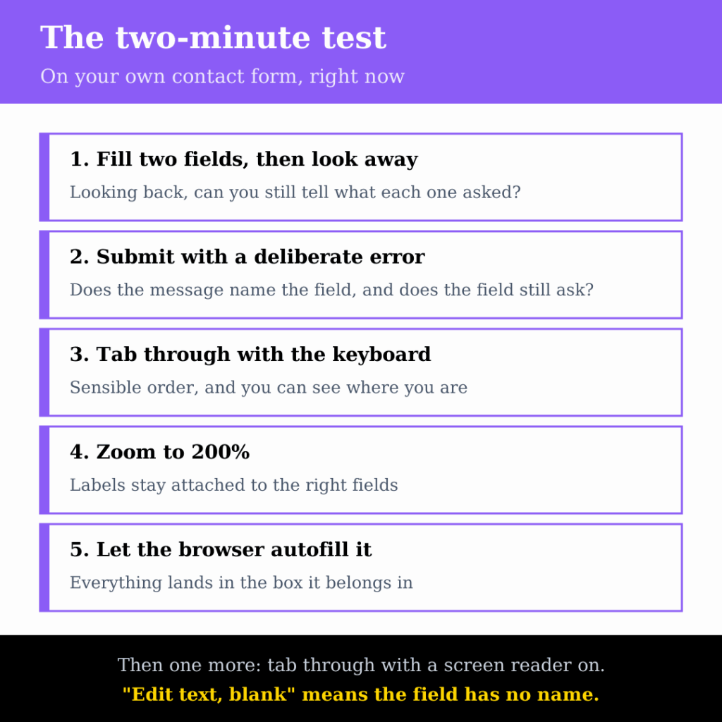
- Fill in the first two fields, then look away and look back. Can you still tell what each one was asking?
- Submit the form with a deliberate error. Does the message tell you which field, and does that field still say what it wants?
- Tab through the form with the keyboard. Does the focus order make sense, and can you see where you are?
- Zoom the page to 200%. Do labels stay attached to their fields?
- Let the browser autofill it. Does everything land in the right box?
- Turn on VoiceOver or NVDA and tab through. Does each field announce a name, or just “edit text”?
Quick Checklist
- Every field has a visible label.
- Each label is linked to its field with
forand a matchingid. - Labels sit above fields, not inside them.
- Hints and format examples sit outside the field and stay visible.
- Placeholders, where used, carry only examples, never the question.
- Label and hint text meets 4.5:1 contrast.
- Fields that collect personal details carry the right
autocompletevalue. - Required fields are marked in text, not by colour or an asterisk alone.
- Error messages name the field and say what to do.
- Tested with a keyboard, at 200% zoom, with autofill and with a screen reader.
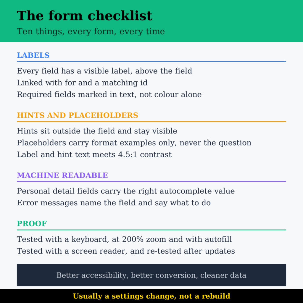
This is a half-hour fix on most sites and a settings change on many of them. It is also one of the few changes that improves accessibility, conversion and data quality at the same time, which makes it an easy one to justify in a build or rebuild that is already tight on budget.
If your contact or checkout form is built on placeholders, it is costing you enquiries and failing to meet the standard at the same time. Get in touch, and we’ll tell you what needs changing.
FAQs
No, they are wrong as a substitute for labels. A placeholder is useful when the expected format is genuinely unclear and an example helps: a date layout, an Eircode, a VAT number, a reference code. The rule is that a placeholder must never carry information the user still needs after they start typing. If the text answers "what goes in this box", it is a label and belongs above the field. If it answers "what should it look like", it can be a placeholder, though a hint underneath the label is more reliable because it does not disappear.
Those are fine in principle and solve the core problem, because the label is a real element that moves rather than placeholder text that vanishes. Two things go wrong in practice. The label shrinks when it floats, and the smaller size often drops below the contrast threshold or becomes hard to read. And at 200% zoom the floated label frequently collides with the field border or the field above it. Both are easy to check and easy to miss, so test the actual implementation rather than trusting the pattern.
Both, and the conversion effect is usually what gets the fix approved. Every re-read, every deleted answer and every moment of hesitation is friction at the exact point where a visitor was ready to act. It also degrades the data you collect, because mismatched fields produce enquiries with a phone number in the company box and an email in the name box. If you are paying for the traffic that reaches the form, this is the cheapest step in the whole funnel to improve.
It depends entirely on what the option does. Some builders visually hide the label while keeping it in the code, which screen readers and speech input still use. Others remove it completely, which fails. Check the rendered page source rather than trusting the setting name. Even where the label is only visually hidden, a visible one is better for everyone else, so reserve hidden labels for cases where the purpose is genuinely obvious from context, such as a single search box beside a search button.
Fill in two fields, look away, then look back and see whether you can still tell what each one asked. That catches the main problem in about ten seconds. After that, submit with a deliberate error and check that the message names the field, tab through with the keyboard, zoom to 200%, and let the browser autofill it. Finally, turn on VoiceOver or NVDA and tab through: if a field announces as "edit text, blank", it has no accessible name and the form fails at Level A.
By Srdjan


