BLOG
What is the secret of a memorable logo? How Matrix’s brand design sets you apart
5 min read
A memorable logo is often the most recognisable expression of a brand. For SMEs across Ireland and Europe, as well as organisations working within EU funded environments, a strong visual identity is not a luxury. It is a strategic asset that supports credibility, trust and long term growth. In competitive digital markets, the right logo helps a business communicate its values in seconds, before a single word is read.
At Matrix Internet, we regularly support teams who are refreshing their brand or building a new identity as part of a digital transformation project. From Enterprise Ireland start ups shaping their first market presence to established organisations modernising their digital footprint, one question often emerges. What is the secret of a logo that people genuinely remember? The answer is never one element alone. It is a combination of clarity, consistency and emotional intent. A memorable logo is not only visually appealing. It reflects who you are, what you stand for and why your audience should trust you. When approached strategically, brand design becomes a powerful tool for differentiation in crowded European markets.
Why logo design matters in today’s digital landscape
The way organisations communicate has changed dramatically. Logos once lived primarily on signage, business cards and brochures. Today they operate across websites, mobile apps, social platforms, funding applications, pitch decks, online dashboards and partner environments.
This means a logo must work everywhere. It needs to be simple enough to scale, flexible enough to adapt and distinctive enough to carry meaning. When designed carefully, a logo becomes a point of recognition that helps audiences instantly understand who they are engaging with.
For SMEs and EU funded partners, this provides several advantages:
- It strengthens visibility in competitive sectors.
- It builds trust with stakeholders and collaborators.
- It supports user experience by creating familiarity across digital channels.
- It helps marketing teams maintain consistency across campaigns.
A memorable logo anchors the entire brand ecosystem, which is why the design process requires both creativity and strategic discipline.
What truly makes a logo memorable?
Many people assume that memorable logos are either unusually creative or visually complex. In reality, the most successful brands take a different path. They prioritise clarity over decoration and intention over trends.
A memorable logo typically has several qualities, but they always work together rather than in isolation.
Clarity of shape and concept
The strongest logos can be recognised quickly, even when viewed at a small size or from a distance. Clear geometry, simple lines and thoughtful negative space allow the design to remain crisp and legible whether it appears on a website header or an app icon.
A sense of meaning
A logo does not need to be literal, but it should feel connected to the organisation’s mission. Something as subtle as a shape, a line direction or a colour choice can express values such as reliability, innovation or community. Meaning is often what transforms a logo from decorative to distinctive.
Consistency across touchpoints
A memorable brand becomes familiar because it appears reliably across all interactions. If a logo changes shape, colour or proportions depending on the channel, audiences lose the emotional connection that repetition builds. Consistency is one of the most powerful tools in brand development.
A focus on audience relevance
Designing purely for personal preference rarely produces long lasting results. Instead, understanding what matters to your audience is vital. A logo designed for an Irish logistics SME will require different visual cues from one created for a European cultural initiative or a digital health start up.
Timelessness over trends
Trends can influence early concepts, but the final design must be able to outlive them. A memorable logo supports long term digital transformation. It should be as strong in five years as it is on launch day.
These principles create the foundation, but differentiation requires deeper thinking.
How brand design helps you stand out from competitors
Differentiation is one of the most urgent priorities for SMEs and EU funded organisations. Many operate in fragmented markets where services can appear similar. A strategic brand identity, supported by a strong logo, helps organisations communicate their strengths in a way that audiences remember. There are several ways this happens. A brand creates emotional clarity. When people feel something positive and consistent across channels, trust increases. This applies equally to customers, funding bodies, innovation partners and internal teams. Brand design also helps organisations position themselves with purpose. A thoughtfully designed logo can reflect innovation, heritage, sustainability or reliability. These signals support storytelling, procurement discussions and cross border collaboration. Digital consistency plays an important role too. Whether a user is browsing a website, reading a proposal or opening a mobile app, the same visual identity helps them feel anchored. Familiarity reduces friction, increases confidence and strengthens the perceived professionalism of the organisation. When differentiation is approached with intention, it becomes much more than looking different. It becomes a way to communicate your organisation’s values, strengths and ambitions.
The strategic process behind effective logo design
The design of a memorable logo is never a single step. It is a structured journey that blends research, creativity and refinement.
Research and discovery
The process begins by understanding the organisation’s vision, target audience, competitors, tone of voice and long term objectives. This ensures the visual identity reflects strategic goals rather than surface level preferences. Market and sector analysis also help identify opportunities for differentiation. For organisations working within EU funded environments, alignment with project themes, innovation priorities or partner expectations may also be important.
Concept development
Early concepts explore shape language, symbolism, typography and colour direction. The goal is to give form to ideas uncovered during research. Concepts are evaluated based on clarity, relevance and long term potential.
Refinement and testing
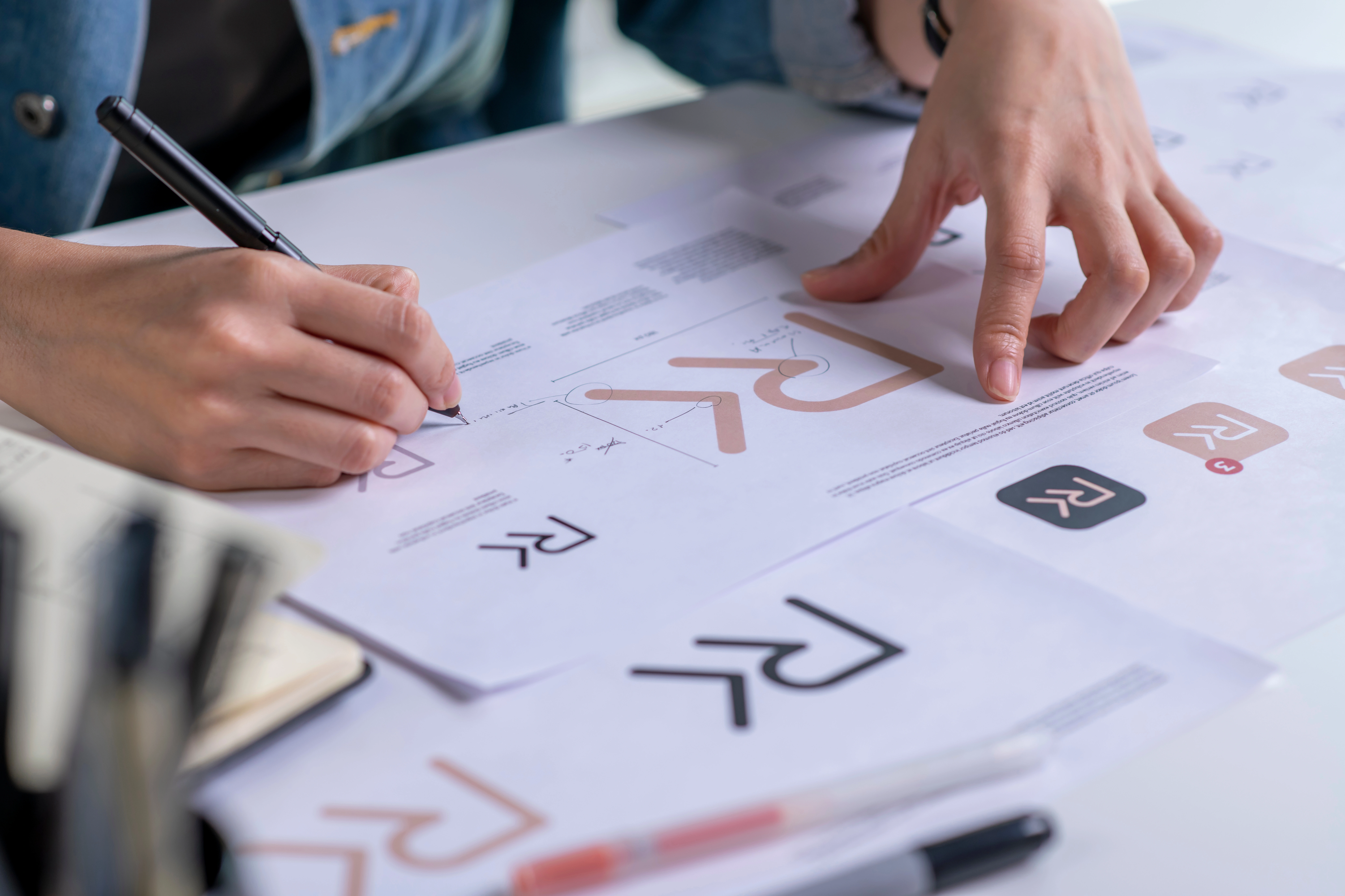
This stage examines how the logo performs across real scenarios. Designers test it in website headers, mobile apps, social media profiles, reports, signage, email signatures and other touchpoints. This ensures the logo remains strong whether it appears large or small, in colour or monochrome.
Finalisation and brand system creation
Once the primary logo is approved, a supporting system is developed. This includes a colour palette, typography, spacing rules, iconography style and guidelines on usage. These assets ensure consistency and protect the clarity of the brand over time. This structured approach ensures that the final identity is not only visually appealing. It becomes a tool for growth, communication and digital confidence.
Practical scenarios for SMEs and EU partners
A memorable logo provides tangible benefits across many contexts. Digital transformation projects gain cohesion when a refreshed identity anchors new websites and applications. Marketing teams can roll out campaigns with greater confidence when visual guidelines are clear. Innovation projects benefit from having a unified identity across multiple European partners. Customer experience improves when users encounter the same branding across digital channels. In every case, clarity and consistency shape perception.
A memorable logo is more than an attractive graphic. It is a strategic asset that supports recognition, trust and long term digital growth. For SMEs across Ireland and Europe, and for organisations working within EU funded environments, a strong visual identity provides clarity in crowded markets. It helps teams communicate who they are, what they do and why they matter. At Matrix Internet, we support organisations at every stage of their brand journey. Whether you are launching a new company, modernising your digital presence or aligning identity across partners, thoughtful brand design ensures you stand out with confidence.
Matrix Internet helps businesses navigate discovery, design, and brand development to turn your visual identity into a strategic asset
FAQs
A memorable logo combines clarity, meaning, consistent use and audience relevance. It should be visually simple yet strategically expressive.
Colour influences emotion and recognition. The right palette supports differentiation and helps a logo feel consistent across all digital and print environments.
Yes. Many organisations update their logo as part of a phased modernisation. A refreshed logo can strengthen visibility without disrupting brand equity.
Consistency builds familiarity. When a logo is applied reliably across channels, audiences recognise your organisation more quickly and feel greater trust.
In many cases, yes. Clear branding helps partners communicate project identity, manage stakeholder expectations and maintain cohesion across borders.


