

BLOG
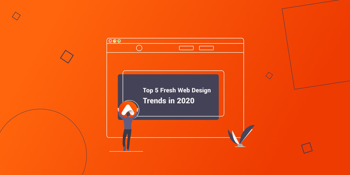
5 Essential Web Design Trends That Drive Engagement
Trends may evolve, but staying current with web design best practices is crucial for satisfying your customers. With today’s instant gratification culture, users are highly attuned to brand messaging and the online experience they expect. If your website fails to meet their needs, they’ll quickly move on to a competitor offering a more personalised experience.
Mobile optimisation has become non-negotiable, as mobile internet traffic has surpassed desktop usage, accounting for over half of all web traffic. Whether you’re curating content for your audience or updating your services to be more eye-catching, these essential web design trends will help you create an immersive digital experience.
If you’d like expert advice on implementing these trends, reach out for more information!
5 Web Design Trends to Transform Your Website
1. Clear and Concise Typography
Modern web users don’t leisurely browse—they scan for information quickly and expect it to be immediately accessible.
Key implementation strategies:
- Bold, oversized text: Use large, impactful statements that clearly communicate what your brand does. Fewer words, bigger impact
- Oversized interactive elements: Apply this trend to images, videos, and menu buttons. For sidebar menus, let them take over a significant portion of the screen when opened, giving users clear navigation choices
- Directional text layout: Incorporate contrasting horizontal and vertical text in bold fonts to break up sections and improve readability. Use this technique sparingly to avoid overwhelming visitors while differentiating your site from competitors
- Image and text masking: Layer images inside large text, contrasted against plain backgrounds. This technique adds visual depth and highlights key messages or calls-to-action throughout your pages
Try tools like Be Funky for experimenting with text masking—it’s free and user-friendly!
Example in action: Butlers Chocolates keeps text minimal, using simple messaging to guide users seamlessly through their website.
2. Distinct Calls-to-Action
The days of burying contact information at the bottom of pages are over. Users now expect critical information above the fold—the visible area before scrolling—or multiple CTAs distributed strategically throughout the page.
Why this matters:
- Mobile devices continue advancing with brighter displays and larger screens, enabling clearer messaging
- Google favors well-optimized mobile websites in search rankings
- A significant majority of mobile users regularly make purchases through their devices
Best practices for effective CTAs:
- Maximise white space: Contrast bold buttons against clean backgrounds with minimal text to emphasise importance
- Full-page forms: These have evolved from simple pop-ups to encompassing the entire screen, offering easy-to-read forms with minimal fields and quick dismissal options (clear “X” button in the top corner)
- Strategic positioning: Place CTAs where users naturally look, keeping them visible even during scrolling
Benefits of full-page forms:
- Highlight the CTA’s importance
- Eliminate distractions, allowing focused decision-making
- Target specific user intentions effectively
Example in action: The DCU website features clear CTAs positioned strategically—a bright “Contact Us” button contrasted with an “Apply Now” button, both above the fold and remaining visible while scrolling.
3. Dark Mode and Monochromatic Design
While white space remains crucial for decluttering websites, “white” space doesn’t literally need to be white. Monochromatic and dark themes have become increasingly popular across all industries.
Why monochromatic works:
- Removes colour distractions, focusing attention on content
- Creates a minimalist aesthetic that doesn’t overwhelm users
- Presents services or products with clarity and sophistication
- Works particularly well for visual-heavy websites
Want to preview your images in black and white? Online conversion tools can help you visualise this transformation!
Example in action: ARENA, a kitchen specialist firm, leverages monochromatic design brilliantly. The minimal black and white palette allows their stunning kitchen imagery to take center stage.
4. Grid-Based Layouts
While designers traditionally use grids during initial website creation, incorporating visible grids as a design element has become a compelling trend. Grids naturally guide users along a path as they navigate your site, making it easier to follow steps toward your services or contact CTAs.
Advantages of grid design:
- Simple yet creative approach to organisation
- Allows for layered boxes that can be customised for specific services or products
- Reinforces the concept of white space by containing text within grids while leaving outer areas clean
- Creates visual hierarchy and improves content digestibility
Example in action: Irish Rail’s website employs a grid organisation that aligns perfectly with their train service business. The layout features easy-to-follow navigation with grids separating items, the journey planner, and other options, all utilising generous white space.
5. 3D Design and Custom Illustrations
With 3D technology and augmented reality becoming mainstream consumer experiences, incorporating these elements into web design keeps your brand at the forefront of users’ minds.
How to leverage 3D and illustrations:
- 3D imagery: Make products literally stand out from the crowd against plain backgrounds
- Custom 3D creations: Design elements that perfectly match your logo and brand identity
- Eye-catching visuals: Neon and bold 3D elements naturally draw readers in
- Illustrative storytelling: Custom illustrations captivate readers and enhance text boxes, login forms, and other functional elements
Colour psychology in illustrations:
- Bold images and vibrant colours communicate energy and excitement
- Soft pastels suggest calm, serene, premium services
- Monochromatic illustrations convey sophistication and focus
Interactive elements: Take visuals further by making them clickable, guiding customers to the next step or page. This type of user-generated interaction creates a more memorable and personalised website experience.
Example in action: The ie Domain Registry uses engaging illustrations that captivate readers while adding visual interest to functional elements like text boxes and login forms.
Bringing It All Together
These five web design trends work synergistically to create websites that are not only visually appealing but also functionally superior. The key is implementing them thoughtfully:
- Prioritise clarity through bold typography and strategic white space
- Guide user behaviour with prominent, well-placed CTAs
- Choose a colour scheme that enhances rather than distracts from your content
- Organise content logically using grid structures
- Add depth and personality through 3D elements and custom illustrations
Remember, the goal isn’t to implement every trend simultaneously, but to select those that best serve your brand identity and user needs. A well-designed website balances aesthetic appeal with functional excellence, creating an experience that keeps visitors engaged and guides them seamlessly toward conversion.
Ready to transform your website? Contact us today to discuss how these design principles can elevate your online presence!
By Matrix Internet


